If you have been anywhere online, whether it be Facebook, Youtube, or even simply on Google, you must have seen this strange art style-- which seems to be taking over the internet in some way. Especially with businesses.
Commissioned by Facebook, a small graphic arts company called “Buck” made a particular art style, simply under the name “Alegria” which means “joy” in Spanish.
Soon enough, so many businesses have either adopted, or flat out stole the style.
So, what exactly happened? How and when did this style grow so popular?
And above all, why is it the go-to art style for businesses?
Well, that’s why we’re here. To figure that out.
Let’s get something out of the way here.
We already know that it originated from Facebook, wanting a “fresh” and “new” style for advertising. So, they commissioned Buck to make one.
However, what exactly was the intent with it?
If you’ve been in our current climate, you’d know diversity is a big thing now.
And for businesses, a very important aspect in advertising.
They want to be seen as “approachable” and “trustworthy” to their target demographic.
And let me tell you, when this style came out, it did have that kind of effect… for a solid few seconds.
When it actually came to people’s feedback on the style, it was received poorly. And it only got worse.
Very, very worse.
It wasn’t until roughly 2018 until people started noticing something about this particular art style, something very strange.
The art style was virtually EVERYWHERE.
From the moment people opened up Google, to the ads received on Facebook, people were noticing Alegria was becoming a lot more widespread than they thought.
It was becoming so popular, it was more than just Facebook and Google using it.
There was Apple, Microsoft, and even other businesses!
Especially during the massive quarantine that happened in early 2020, where companies whipped out their style for masking and health campaigns.
That’s when the internet did what it did best- and that was to make fun of the corporations who used this art style.
One of the first people who complained about Alegria was a Twitter user by the username of JackDexerity, who posted a tweet about the widespread attention of the style.
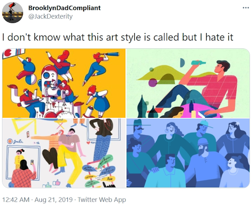
Soon enough, people started to finally catch up on the style, and people grew just as annoyed as the tweets made about it.
Soon enough, people decided to make parodies of the style.
Along with other memes dragging on the style.

This picture being a popular one, this picture is a parody of ‘Saturn Devouring Her Son.’
This is often the first thing you see when browsing through all of the searches relating to “corporate art style.”
And that’s the thing-- this style has undergone many names.
So many in fact, that no one remembers the style being from Facebook and called “alegria.”
Everyone either calls it the “corporate art style,” or “the big tech art style.”
But, it’s more than just the art parodies that people are making to rag on the style, they’ve expressed their hate multiple times, mostly because of it’s laziness and it’s overexposure.
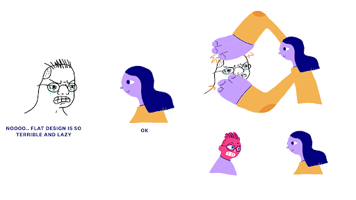
Another popular meme that spawned from the corporate style was this wojak meme, made by Twitter user ‘johnny2x4,’ also during the peak of the style’s exposure.
This also sparked a strange debate in the art community.
Does this style, the one with the characters with limbs that are essentially noodles, with non-existent shading and no real sense of cohesion, real art?
Well, that answer is complicated.
Even when this was explicitly commissioned to be a “diverse” and “unique” art style, it obviously isn’t anymore.
So, is it art?
Eh… it all depends on the artists you talk to.
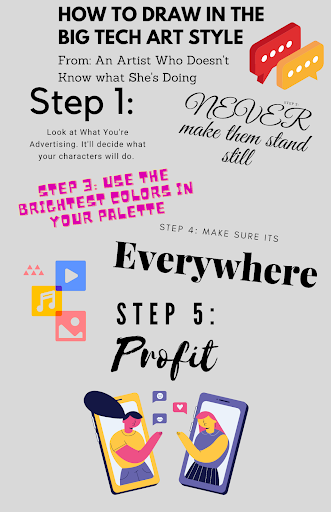
However, to go into the meat and crux of this style, I have produced a guide to draw in the infamous style that’s everywhere on the internet!
Feel free to use your own tips to make your alegria creations! And yes, I did make this just for this article.
Have fun with your corporate art style.
